CSS Overview
CSS cheat sheet: html & css provided by Traversy Media
Font
font-size size
font-family: <FAMILY_NAME>, <GENERIC_NAME>;
font-family: Lobster monospace;
GENERIC_NAME: sans-serif serif monospace;
sans-serif force on connected and serif force on single alphabet.
line-height: 25px;
Import font
Could use google font and add link into index.html or in style.css
Control space
There are three important properties to control the space: padding, margin and border
Border
border-size
border-color
border-width
border-style
border: <border-width> <border-style> <border-color>
padding
Padding control the amount of space between the element’s content and its border;
padding-top padding-right padding-bottom padding-left
or specify them all in one line clockwise:
padding: 20px 10px 20px 10px;
or specify top-bottom and left-right
padding: 20px 10px;
Margin
margin controls the amount of space between an element’s border and surrounding elements.
margin-top margin-right margin-bottom margin-left
or specify them all in one line clockwise:
margin: 20px 10px 20px 10px;
or specify top-bottom and left-right
margin: 20px 10px;
CSS inheritance
Afterword can overwrite previous.
Id will always take precedence.
<style>
  body {
    background-color: black;
    font-family: monospace;
    color: green;
  }
  #orange-text {
    color: orange;
  }
  .pink-text {
    color: pink !important;
  }
  .blue-text {
    color: blue;
  }
</style>
<h1 id="orange-text" class="pink-text blue-text" style="color: white">
  Hello World!
</h1>
text
text-align: justify; causes all lines of text except the last line to meet the left and right edges of the line box.
text-align: center; centers the text
text-align: right; right-aligns the text
text-align: left; (the default) left-aligns the text.
text-overflow: ellipsis; ellipsis text overflow (…)
decoration
font-weight: bold;
text-decoration: underline;
font-style: italic;
text-decoration: line-through;
transform
The text-transform property in CSS is used to change the appearance of text. It’s a convenient way to make sure text on a webpage appears consistently, without having to change the text content of the actual HTML elements.
| Value | Result |
|---|---|
| lowercase | “transform me” |
| uppercase | “TRANSFORM ME” |
| capitalize | “Transform Me” |
| initial | Use the default value |
| inherit | Use the text-transform value from the parent element |
| none | Default: Use the original text |
Box shadow
The box-shadow property applies one or more shadows to an element.
The box-shadow property takes values for
offset-x(how far to push the shadow horizontally from the element),offset-y(how far to push the shadow vertically from the element),blur-radius,spread-radiusandcolor, in that order.
The blur-radius and spread-radius values are optional.
Multiple box-shadows can be created by using commas to separate properties of each box-shadow element.
opacity
The opacity property in CSS is used to adjust the opacity, or conversely, the transparency for an item.
A value of 1 is opaque, which isn’t transparent at all. A value of 0.5 is half see-through. A value of 0 is completely transparent.
transform
MDN: https://developer.mozilla.org/en-US/docs/Web/CSS/transform
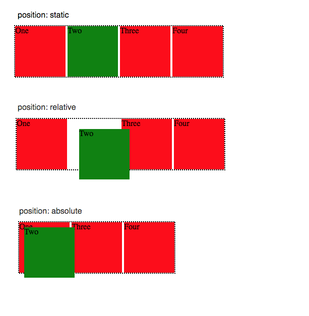
position
The position property specifies the type of positioning method used for an element.
you have top left bottom right to set the position
There are five different position values:
- static: default
- relative: relative to normal position
- absolute: target wherever position inside of a relative element (
- fixed: fix to browser window
- sticky
position
This is another post shows different
white-space
| new line | space and tab | text wrapping | End line space | |
|---|---|---|---|---|
| normal | collapse | collapse | wrap | Remove |
| nowrap | collapse | collapse | no wrap | Remove |
| pre | preserve | preserve | no wrap | Preserve |
| pre-wrap | preserve | preserve | wrap | Hang |
| pre-line | preserve | collapse | wrap | Remove |
| break-space | preserve | preserve | wrap | Wrap |
Here is my Example: Try it Now
linear-gradient
background: linear-gradient(30deg, #cff, #fcc);
    repeating-linear-gradient(
        90deg,
        yellow 0px,
        blue 40px,
        green 40px,
        red 80px
    );
0px [yellow – blend – blue] 40px [green – blend – red] 80px
animate
Example
<style>
  button {
    border-radius: 5px;
    color: white;
    background-color: #0f5897;
    padding: 5px 10px 8px 10px;
  }
  button:hover {
    animation-name: background-color;
    animation-duration: 500ms;
    animation-fill-mode: forwards;
  }
  @keyframes background-color {
    100% {
      background-color: #4791d0;
    }
  }
</style>
<button>Register</button>
keyframes
MDN: https://developer.mozilla.org/en-US/docs/Web/CSS/@keyframes
animation
MDN: https://developer.mozilla.org/en-US/docs/Web/CSS/animation
transition
CSS transitions provide a way to control animation speed when changing CSS properties. Instead of having property changes take effect immediately, you can cause the changes in a property to take place over a period of time. For example, if you change the color of an element from white to black, usually the change is instantaneous. With CSS transitions enabled, changes occur at time intervals that follow an acceleration curve, all of which can be customized.
MDN: https://developer.mozilla.org/en-US/docs/Web/CSS/transition
cubic-bezier
A curve about about animation speed.
Use two point to decide the curve
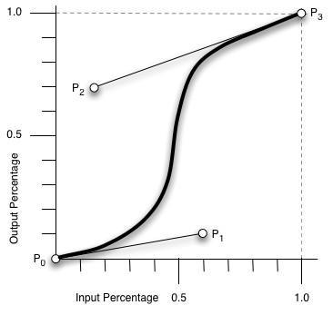
curve line
tabindex
<style>
  p:focus {
    background-color: yellow;
  }
</style>
<p tabindex="0">
  Instructions: Fill in ALL your information then click <b>Submit</b>
</p>
display
https://developer.mozilla.org/en-US/docs/Learn/CSS/Building_blocks/The_box_model
block vs inline vs inline-block
https://www.digitalocean.com/community/tutorials/css-display-inline-vs-inline-block
Layout
There is an another compare flex and grid: Flex and Grid in CSS
Flex
Sample code provided by Traversy Media
More Detail in Flex and Grid in CSS
Cheat Sheet provide by CSS-tricks.com
grid
More Detail in Flex and Grid in CSS
Cheat Sheet provide by CSS-tricks.com
z-index
Move some element to the front or back.
z-index = 10;
Personal default style
button
.btn {
  display: inline-block;
  padding: 5px 30px;
  background: var(--primarily-color);
  color: #fff;
  border: 1px #fff solid;
  border-radius: 5px;
  margin-top: 25px;
  opacity: 0.7;
}
.btn:hover {
  transform: scale(0.98);
}
pseudo-classes & pseudo-elements
Ref: https://developer.mozilla.org/en-US/docs/Web/CSS/Pseudo-elements
A CSS pseudo-element is a keyword added to a selector that lets you style a specific part of the selected element(s).
Pseudo-elements create abstractions about the document tree beyond those specified by the document language. For instance, document languages do not offer mechanisms to access the first letter or first line of an element’s content. Pseudo-elements allow authors to refer to this otherwise inaccessible information. Pseudo-elements may also provide authors a way to refer to content that does not exist in the source document (e.g., the ::before and ::after pseudo-elements give access to generated content).
Ref: https://developer.mozilla.org/en-US/docs/Web/CSS/Pseudo-classes
A CSS pseudo-class is a keyword added to a selector that specifies a special state of the selected element(s).
The pseudo-class concept is introduced to permit selection based on information that lies outside of the document tree or that cannot be expressed using the other simple selectors.
pseudo-elements use (::) like ::before
pseudo-class use (:) like :hover, :nth-child()
symbols in CSS selectors
- Descendant Selector (space)
- Child Selector (>)
- Adjacent Sibling Selector (+)
- General Sibling Selector (~)
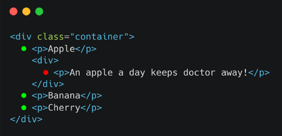
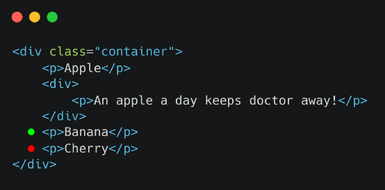
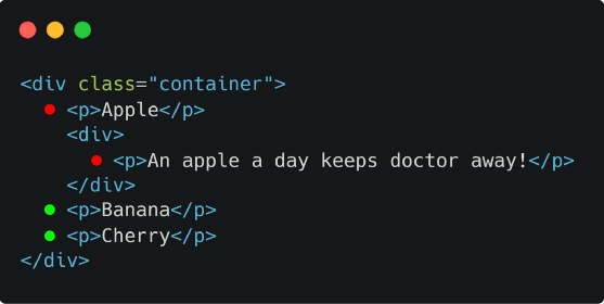
For a Same HTML part
<div class="container">
  <p>Apple</p>
  <div>
    <p>An apple a day keeps doctor away!</p>
  </div>
  <p>Banana</p>
  <p>Cherry</p>
</div>
space
div.container p {
  font-size: 20px;
}
Choose all p tag
(>)
div.container > p {
  border-bottom: 1px dashed black;
}
Child Selector
(+)
div + p {
  background-color: yellow;
}
Adjacent Sibling Selector
(~)
div ~ p {
  background-color: yellow;
}
General Sibling Selector
Different between initial, inherit, unset & revert
initial
set field into css default value, not browser default value (user agent stylesheet)
inherit
inherit parent html container setting
unset
unset = inherit + initial
if property can inherit parent, set to inherit. Otherwise, set to initial
{all: unset} can set all properties to inherit or initialrevert
set property to browser default value (user agent stylesheet)
counter
Counting can happen in CSS.
.container {
  counter-reset: any_counter_name 0;
}

.container span {
  counter-increment: any_counter_name 1;
}

.container span::before {
  content: '(' counter(any_counter_name) ') ';
}
Here is my Example: Try it Now